

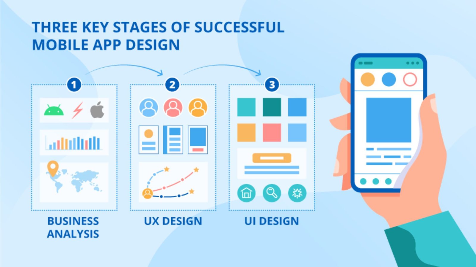
Designing a mobile app involves much more than arranging buttons, choosing colors, and creating attractive screens. A successful product needs to solve a clear user problem while making common actions easy to understand and complete. If you are learning how to design mobile apps, the process should begin with users and their goals, then move through information architecture, wireframes, visual design, prototyping, testing, and refinement.
Apple’s current design guidance emphasizes clear structure, intuitive navigation, appropriate content, and platform-aware interfaces. Its app-design resources also recommend defining user needs, prioritizing features, mapping journeys, creating interactive prototypes, and testing designs before development.
Start With the User Problem
Before opening Figma or another design tool, define what the app is supposed to accomplish.
Ask:
- Who will use the app?
- What problem are they trying to solve?
- What task should be easiest to complete?
- Why would they choose this app instead of an alternative?
- What information do they need before taking action?
A food-ordering app, for example, should make restaurant discovery, menu browsing, customization, payment, and order tracking straightforward. A fitness app may prioritize workout selection, progress tracking, and reminders instead.
The answers determine the product’s priorities. They also prevent a common mistake: adding features simply because they seem interesting rather than because users need them.
Map the App Structure
Once the primary user problem is clear, organize the content and features into a logical structure. This is the information architecture stage.
List the major areas of the product and determine how users move between them. For a shopping app, the structure might include home, categories, search, product details, cart, orders, and account settings.
Keep the most important destinations easy to reach. Avoid making users repeatedly navigate backward through several screens to complete a routine task.
A useful rule is to design around user journeys rather than isolated screens. Think through the complete path from the first interaction to the desired outcome.
| Design Stage | Main Goal | Typical Output |
|---|---|---|
| User research | Understand needs and problems | User insights |
| Information architecture | Organize content and features | App structure |
| Wireframing | Plan screen layouts | Low-fidelity screens |
| Prototyping | Simulate interactions | Clickable prototype |
| Visual design | Establish the interface style | High-fidelity UI |
| Testing | Find usability problems | Feedback and revisions |
| Handoff | Prepare for development | Design specifications |
Create Wireframes Before Visual Design
Wireframes provide a simple blueprint for the interface. They show where navigation, content, buttons, forms, images, and other components will appear without distracting the team with colors and decorative details.
Start with the screens that matter most to the main user journey. Sketch the home screen, primary action, key content pages, and completion or confirmation screen.
Low-fidelity wireframes are useful because they make structural problems inexpensive to fix. If a checkout flow requires too many steps, changing a rough wireframe is easier than rebuilding a polished interface.
At this stage, concentrate on hierarchy. Users should quickly understand what the screen is about, what they can do, and what action deserves their attention.
Design Navigation Around Familiar Patterns
Good navigation reduces the amount of thinking required to use an app. Navigation patterns should match the platform and the product’s content structure rather than being created solely for visual originality.
For example, frequently used destinations may work well in persistent navigation, while secondary functions can remain within menus or contextual controls.
Platform conventions matter too. Apple’s Human Interface Guidelines provide resources for designing interfaces that fit Apple platforms, while its current design documentation emphasizes familiar organization, navigation, content, and controls.
Android products should likewise account for established Android interface conventions instead of treating an iPhone interface as a universal template.
Build a Consistent Visual System
After the structure works, develop the visual language.
Choose a limited color palette, readable typography, consistent spacing, recognizable icons, and reusable interface components. A design system can help keep buttons, forms, cards, navigation elements, and states consistent throughout the product.
Consistency is not about making every screen identical. It means that similar actions look and behave similarly, so users can transfer what they learn from one part of the app to another.
Pay particular attention to hierarchy. Larger or more prominent text can establish headings, while spacing and contrast can separate groups of information. Important actions should be visually distinguishable without overwhelming the screen.
Make Touch Interaction Accessible
Touch interfaces require careful attention to control size, spacing, contrast, labels, and alternative interaction methods.
W3C’s WCAG 2.2 guidance includes a minimum target-size criterion of 24 by 24 CSS pixels for applicable pointer targets, with exceptions, while its enhanced criterion recommends 44 by 44 CSS pixels. These requirements and recommendations are designed to reduce accidental activation and make controls easier to operate.
Accessibility also extends beyond button dimensions. Consider readable text, sufficient contrast, meaningful labels, screen-reader compatibility, and interactions that do not depend entirely on complex gestures. W3C specifically discusses mobile accessibility across touchscreens, small displays, different input methods, and other mobile-use conditions.
💡 Pro Tip:
Test important controls with one hand on an actual phone. If a user has to stretch, reposition the device, or repeatedly aim for a tiny icon, the interface probably needs another design pass.
Turn the Screens Into a Prototype
A prototype connects individual screens into a realistic flow. Instead of looking at static designs, testers can tap buttons, open menus, move between screens, and experience the intended journey.
Prototype the highest-value interactions first. You do not need every minor animation or setting before receiving feedback.
Test questions should be practical:
- Can users identify what to do next?
- Do they understand the labels?
- Can they recover from mistakes?
- Do they know when an action has succeeded?
- Are important functions easy to find?
The purpose is not to prove that the original design is correct. It is to discover where users become confused.
Test on Real Devices
A design that looks excellent on a large desktop monitor can behave differently on a phone. Screen dimensions, operating-system conventions, keyboard behavior, network conditions, text scaling, and touch interaction can all expose problems.
Test different screen sizes and, where relevant, both major mobile platforms. Check scrolling, forms, error states, loading behavior, orientation, permissions, notifications, and interrupted sessions.
Accessibility testing should be part of this process rather than a final checkbox. Apple’s resources highlight accessibility features and tools, while W3C provides mobile-specific guidance for applying accessibility principles to mobile applications.
Common Mobile App Design Mistakes
Several problems appear repeatedly in weak app interfaces:
- Too many features on the first screen: Users struggle to identify the primary action.
- Unclear icons: Familiar-looking symbols can still be ambiguous without labels or context.
- Long onboarding: Asking for unnecessary information before demonstrating value creates friction.
- Inconsistent controls: Different visual treatments for the same function make the interface harder to learn.
- Tiny touch targets: Small controls increase tapping errors.
- Ignoring empty and error states: Screens need useful responses when content is unavailable or an action fails.
- Designing only for ideal conditions: Slow connections, interruptions, and different devices should be considered during testing.
The goal is not to remove every advanced feature. It is to ensure that complexity appears only where it serves a genuine user need.
Refine Before Development
Once testing reveals problems, revise the design before handing it to developers. Prioritize issues that block important tasks, cause repeated errors, or create confusion.
Prepare clear specifications for dimensions, spacing, typography, colors, states, interactions, and responsive behavior. Developers should understand not only what each screen looks like, but also what happens when users tap, submit, cancel, fail validation, lose connectivity, or return later.
Knowing how to design mobile apps therefore means thinking about behavior as carefully as appearance. A polished screen is only one part of a functional product.
📌 Key Takeaway:
The strongest mobile app designs begin with a specific user problem, simplify the main journey, use familiar interaction patterns, support accessibility, and improve through real-device testing. Visual polish matters, but clarity and usability should guide the design decisions behind it.
Frequently Asked Questions
What is the first step in designing a mobile app?
Start by defining the target user’s problem and the main outcome the app should provide. Identify the primary audience, their needs, and the most important task they must complete. This foundation helps determine which features deserve priority and prevents the interface from becoming unnecessarily complicated.
What tools can be used to design mobile apps?
Designers commonly use interface and prototyping tools such as Figma, Sketch, or similar software. The specific tool matters less than the workflow. The design should support wireframing, reusable components, interactive prototypes, collaboration, testing, and clear handoff to developers.
How many screens should a mobile app have?
There is no universal ideal number. The required screen count depends on the app’s purpose, features, and user journeys. Instead of targeting a specific number, identify the screens required to complete important tasks and remove unnecessary steps or duplicate destinations.
Why is mobile app accessibility important?
Accessibility helps people with different abilities use the interface effectively. It also improves general usability by encouraging readable content, clear controls, sufficient spacing, understandable interactions, and alternatives to complex gestures. W3C’s mobile accessibility guidance applies these principles across native and other types of mobile applications.
Should a mobile app be designed for iOS and Android separately?
The core product experience can remain consistent, but platform-specific details should be considered. Navigation, controls, system behaviors, typography, and interaction conventions can differ. Following each platform’s established guidance can make the application feel more natural to its users.
Conclusion
Learning how to design mobile apps is ultimately about turning a user need into a clear, usable experience. Start with the problem, map the journey, create wireframes, establish a consistent interface, prototype important interactions, and test the result on real devices.
Strong app design does not require filling every screen with features. It requires thoughtful decisions about what users need, what they should see next, and how easily they can complete their goals.
